Project Charts and Graphs (click to enlarge):
[Return to ESRC 'Diversity and the White Working Class' Research Project Home Page]
UKIP support in 2010-12 Local Elections, by ward. Note overlap with BNP support (next chart) in Pennine Towns, Outer East London and Thames Gateway. New areas of support in parts of East Anglia-Lincolnshire
Download pdf (right-click and download is recommended due to file size; can zoom on areas within pdf)
Source: Data adapted from University of Plymouth Local Elections Centre (http://www.plymouth.ac.uk/elections)
BNP support in 2010-12 Local Elections, by ward. Strength in Pennine Towns and parts of Outer West, East and South London and Essex/Thames Gateway
Download pdf (right-click and download is recommended due to file size; can zoom on areas within pdf)
Source: Data adapted from University of Plymouth Local Elections Centre (http://www.plymouth.ac.uk/elections)
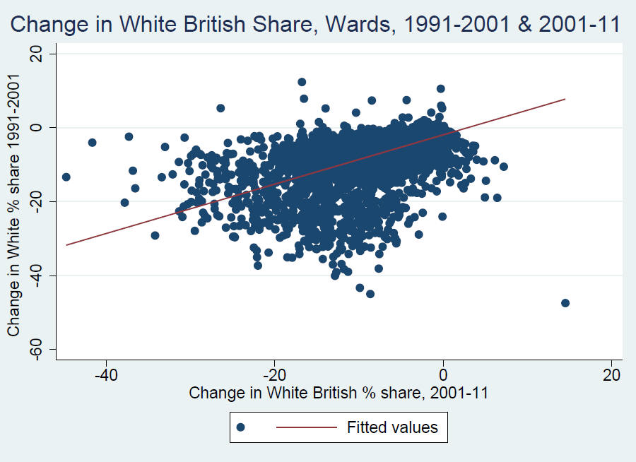
Wards which lost most whites in 1991-2001, lost most white British in 2001-11
Source: ONS census 1991, 2001, 2011
Local Authorities which lost most white British (in absolute terms) also gained most ethnic minorities, 2001-11
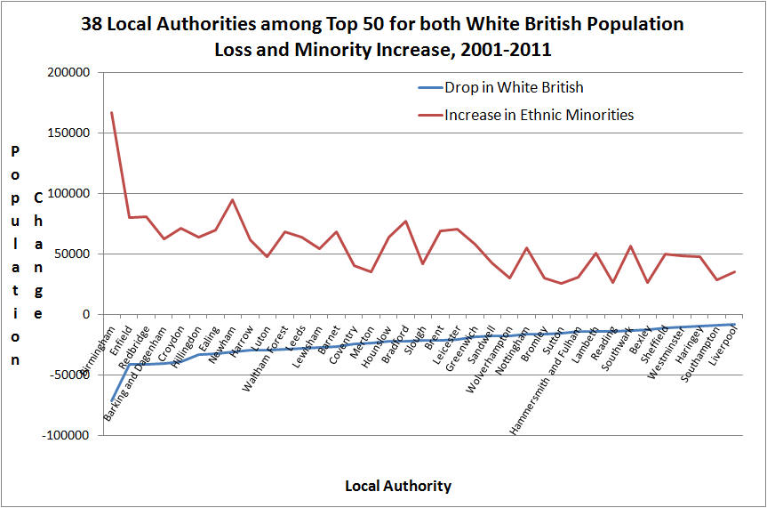
Source: ONS census 2001, 2011
London has been losing white British people to the rest of the UK since the 1870s:
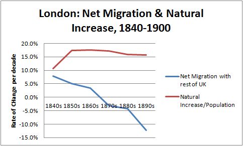
Source: Historic Census of England and Wales, 1841-1901
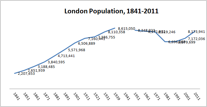
London's population grew through natural increase until WWII, then, despite increased European immigration, declined:
a) Aggregate Population, London, 1841-2011 (note the unprecedented decline post-1939, and recovery from early 90s)
b) London population since 1841, showing contribution of foreign born to total (note substantial rise in immigration since 1939 - shift to census data in 1971 accounts for abruptness of line)

Source: Historic Census of England and Wales, 1841-1901; Hechter, M., U.K. County Data, 1851-1966 [computer file]. Colchester, Essex: UK Data Archive [distributor], 1976. SN: 430, http://dx.doi.org/10.5255/UKDA-SN-430-1; ONS Census 1971-2011
White British Location Quotient, London, 2001 (where LQ of 1 indicates that the ward has same share of white British as London as a whole)

Source: ONS Census 2001
Dark blue areas have higher white British concentration than London average, lighter areas lower than London average
White British Location Quotient, London, 2011
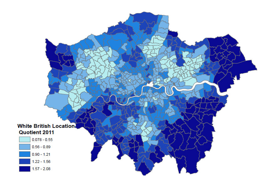
Source: ONS Census 2011
Change in White British Location Quotient, London, 2001-11 (notice how white British increase is generally in whiter areas)

Source: ONS Census 2001-11
Bangladeshi Location Quotient, London, 2011
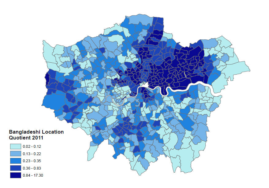
Source: ONS Census 2011
Change in Bangladeshi Location Quotient, London, 2011 (notice that Bangladeshi growth is generally in formerly non-Bangladeshi areas, indicating dispersion, a contrast to the white British, who have ingathered)
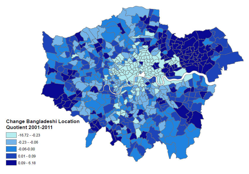
Source: ONS Census 2001-11
FULL PDF OF LOCATION QUOTIENTS FOR ALL MAJOR ETHNIC GROUPS IN ENGLAND AND WALES, 1991-2011 (flip through the charts to see how the picture evolves over time). Warning: 35 MB file, so best to right-click and download.
Bangladeshi growth in population share, 1991-2011, is even across wards which are more or less Bangladeshi. (second graph 2001-11). Indicates dispersal:
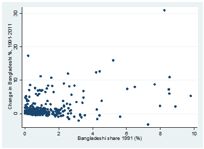
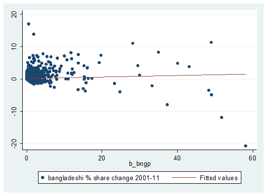
Source: ONS Census 1991, 2001, 2011
Caribbean growth in population share, 2001-2011, is greater in non-Caribbean than Caribbean wards, indicating rapid dispersal

Source: ONS Census 2001, 2011
Pakistani growth in population share, 1991-2011, is greater across wards which are more Pakistani. Indicates limited dispersal
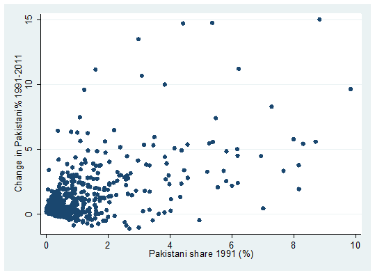
Source: ONS Census 1991, 2001, 2011
Minorities (altogether) growth in population share, 2001-2011, is much greater across wards which have more minorities. Indicates limited dispersal: less than for Pakistanis, Bangladeshis or Afro-Caribbeans. This is not because this graph just adds up individual minority movement: minorities are generally not located in the same areas.
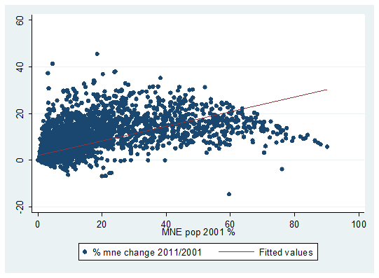
Source: ONS Census 2001, 2011
Whiter Wards in England & Wales tend to retain white share more than those with larger shares of ethnic minorities (MNE), 1991-2011 data. Indicates white ingathering. Note that above 30-50% minorities, data are less reliable because there is less room for % white to decline and more to increase. Following slide shows more accurate measure for higher levels of MNE%, which is absolute white change per initial white population, this line runs steadily downward.
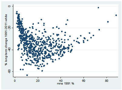
Source: ONS Census 1991, 2001, 2011
Whiter Wards in England & Wales tend to gain or retain white British population more than those with larger shares of ethnic minorities, 2001-11 data. This more to do with white residential preferences, but also to do with the greater economic amenities in whiter areas:
Source: ONS Census 1991, 2001
This chart shows that minorities are leaving own-group areas and white areas for mixed-minority areas (this at output area level which averages around 100 households):

Source: R. Johnston, M. Poulsen, J. Forrest, Multiethnic residential areas in a multiethnic country? A decade of major change in England and Wales,’ Environment and Planning A 2013, volume 45, pages 753 – 759
Three charts of trends in inter-ethnic segregation (at ward level) in England and Wales, 1991-2011. Notice that:
a) White-Minority Segregation Unchanged
b) White-Individual Minority Segregation down a bit
c) Minority-Minority segregation down most (note wider spread of vertical axis)
Whiter Wards in England and Wales tend to gain or retain white population more than those with larger shares of ethnic minorities, 1991-2001 data.
Source: ONS Census 1991, 2001
Manchester:
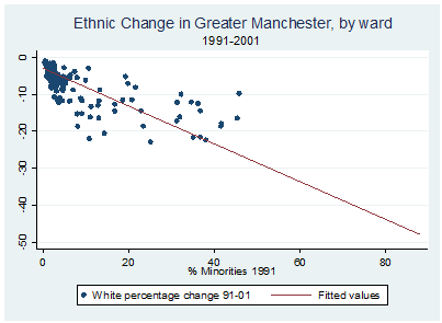
Source: ONS Census 1991, 2001
Birmingham/West Midlands:
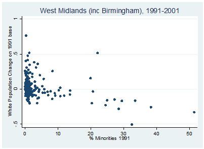
Source: ONS Census 1991, 2001
Toronto, Canada:
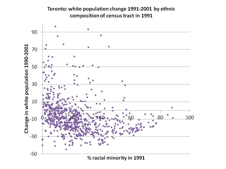
Source: Census of Canada 1991, 2001
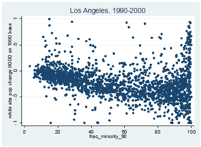
Los Angeles:
Source: Card, Mas et. al 2008 dataset
New York:
Source: Card, Mas et. al 2008 dataset
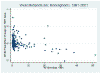
Vancouver, Canada:
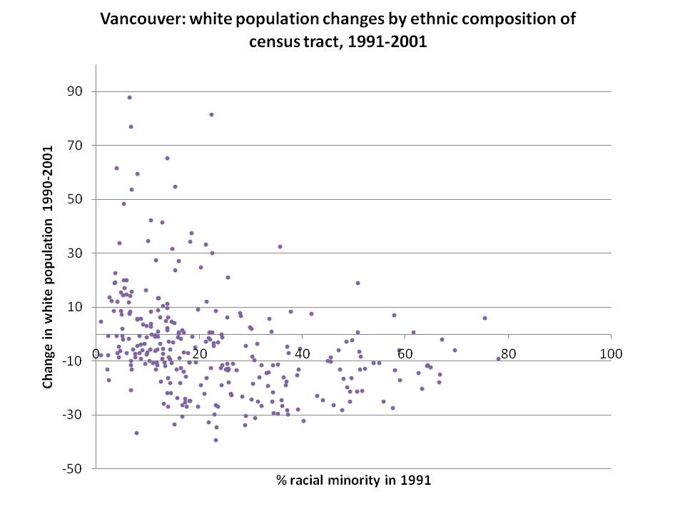
Source: Census of Canada 1991, 2001
Change in White British Population by ward, London and the South East, 2001-2011

Source: ONS Census 2001 and 2011
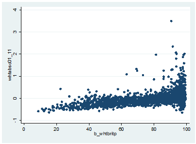
8850 English/Welsh Wards, (pop. roughly 10k-30k), arrayed by share of ethnic minorities in 2001 and change in absolute numbers of white British people 2001-2011. Source: ONS Census 2001 & 2011

White Population change by US census tract, 1970-2000, by share of ethnic minorities in tract in 1970. Source: Data from Card, Mas and Rothstein 2008

White Opinion on Immigration by Diversity of Ward (in bands of 1-10), and by Class, Aggregated Citizenship Surveys 2007-10. Note that opinion is more opposed in wards with fewer minorities, and that working class are more opposed than average, especially in diverse areas. Source: Home Office Citizenship Surveys 2007-10 & ONS Census 2011

Same pattern of diversity of ward and class affecting white opposition to immigration when we use share of recent (>10 yrs) immigrants in 2011. Source: Home Office Citizenship Surveys 2007-10 & ONS Census 2011:

But 1/3 of this effect is caused by the fact that whites living in areas with more minorities tend to be - or identify as - 'White Other' rather than White British. Source: Home Office Citizenship Surveys 2007-10 & ONS Census 2011

Another 1/3 of this effect is associated with the fact that areas with many minorities tend to be transient inner city wards. Transient whites (renters) are more liberal in their views than those who own or live in council housing. But there is still a 'contact' effect whereby increased exposure to minorities seems to be linked with more support for immigration. However, this holds only for upper and middle classes and does not hold for the white working class.
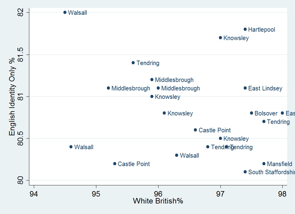
Most English wards in England 2011 (proportion answering 'English' only as their national identity) by share White British ethnicity. Note that there are always more white British ethnics than English national identifiers because some will answer a Celtic or British national identity instead. Source: ONS Census 2011
Pakistani and Bangladeshi populations by ward in England 2011 (note the two groups largely live in different areas) Source: ONS Census 2011

Outer, poorer and more diverse boroughs lose white British population. Source: ONS Census 2001 & 2011:

Lighter areas have most loss, darkest have population gains (numbers in key) Source: ONS Census 2001 & 2011:

Comparison: Ethnic Change in New York City Area, 2000-2010 (Note the decline in 90-100% white areas (in dark blue), erosion of 90-100% black areas (in dark brown), as well as growth of Hispanic (green) and Asian (purple) plurality/majority areas. In contrast to London, New York City's white population remained very stable at about 1/3 of the population (78,000 loss in NYC over 2000-10 against London's 610,000 decline in white British over same period, both on population base of 8m). Whites increased through gentrification in south Harlem and sections of Brooklyn closest to Manhattan - or in ultra-Orthodox Jewish districts of Brooklyn through high birthrates. Working-class and middle-class white neighbourhoods in Queens and Staten Island saw significant white declines. Suburban areas became less monolithically white, reflecting minority suburbanisation.
White British Decline in Share of Population is Highest in Inner London, followed by Outer London, then by Southeast. Source: ONS Census 2001 & 2011: :

White British absolute population decline is, however, greater in Outer London, followed by Inner London, with net gain in Southeast. Source: ONS Census 2001 & 2011: :

Drop in white British, big rises in 'other White', 'other Asian' and Racially Mixed rather than established Caribbean and South Asian groups. White British outflow, more diverse immigration and Caribbean-white intermarriage key. Source: ONS Census 2001 & 2011:

Proportionate Change by Ethnic Group 2001-2011. Source: ONS Census 2001 & 2011:

Christian Decline is Inversely Proportional to White British Decline because white British are more nonreligious than minority ethnic groups. Source: ONS Census 2001 & 2011:

London, especially North London, is an emerging religious island in a secular English sea. The relatively Catholic North West is also quite religious. Source: ONS Census 2011:

Diverse London Local Authorities have fewer secular people. Source: ONS Census 2001 & 2011:

[Return to ESRC 'Diversity and the White Working Class' Research Project Home Page]